- Home
- Services
- Portrait Retouching Services
- Wedding Photo Editing Services
- Color Correction Services
- Glamour Retouching Services
- Photo Retouching Services
- High End Photo Retouching Services
- Background Removal Services
- Photo Correction Services
- Photo Post Processing Services
- Photo Enhancement Services
- Photo Post Production Services
- Photo Culling Services
- Pricing
- Portfolio
- Shop
- Blog
- Login
How to Make an Album Cover in Photoshop in 10 Steps
-
Juli Allen
-
April 29, 2022
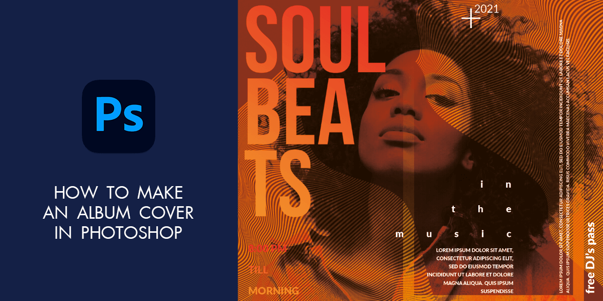
You can be a very gifted musician but when it comes to selling your albums, you need to entice people with a catchy cover so that they want to open their purses and spend some money. If you don’t know how to make an album cover in Photoshop, this tutorial is just what you need. I will dwell on how to choose the correct photo, combine colors, add effects, and select fonts.
This tutorial is devoted to the process of creating an album cover and every step is explained in a very straightforward way. WeEdit.Photos team usually uses Photoshop for such a task.
You will find out how to create a composition with several images to make an original cover. I will also share recommendations on how to compose several images into one and what album cover size Photoshop to choose.
Make an Album Cover in Photoshop in 10 Steps
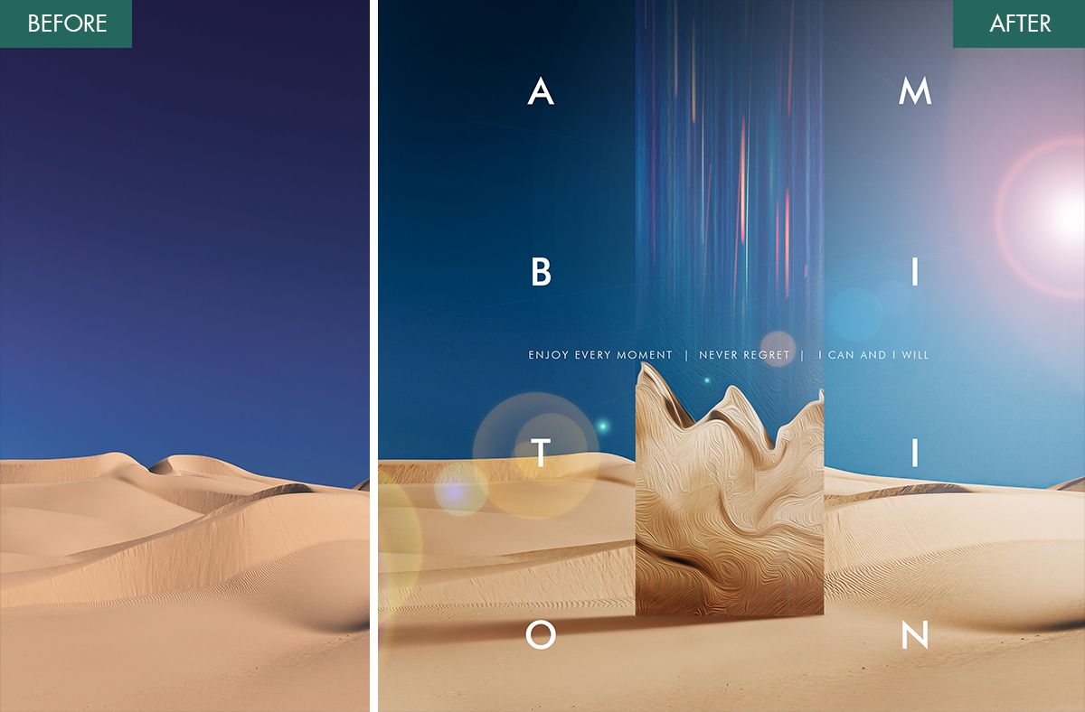
Photoshop is a popular photo editing software for photographers, which contains all the needed tools and features for designing an attention-grabbing cover. If you are pressed for time to create the design yourself, entrust the task to our experts. You will be pleased with affordable photo editing prices and a fast turnaround.
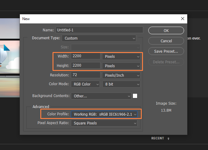
Step 1. Start the program and create a new document. You can use the same values as in my screenshot or try something different. Just remember to stay within the recommended range of 1600×1600 – 3000×3000. The color profile should be set to RGB.
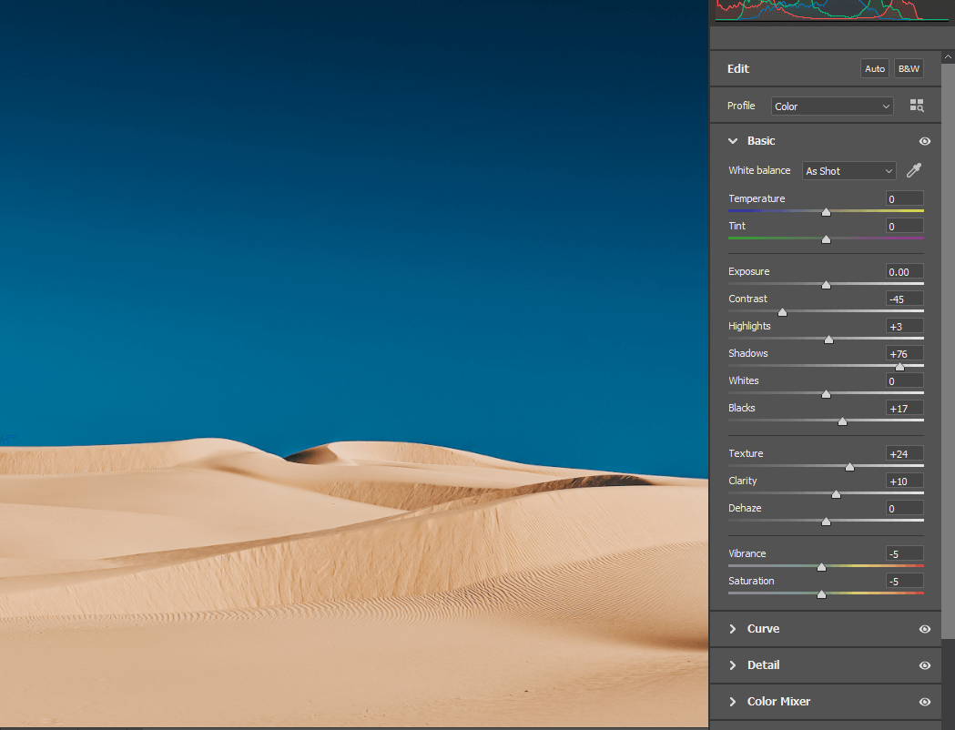
Step 2. Upload a photo. Before we create an album cover Photoshop, you need to head to Photoshop Camera Raw to correct colors. Or, you can learn how to download presets to Lightroom and make the needed tweaks in that program in an instant.
Pro Tip:
While choosing a photo for a cover, keep in mind that currently, naturalness is in trend. So, you can see lots of samples of behind the scenes photography used in media, on Instagram feed, and in the production of album covers as well.
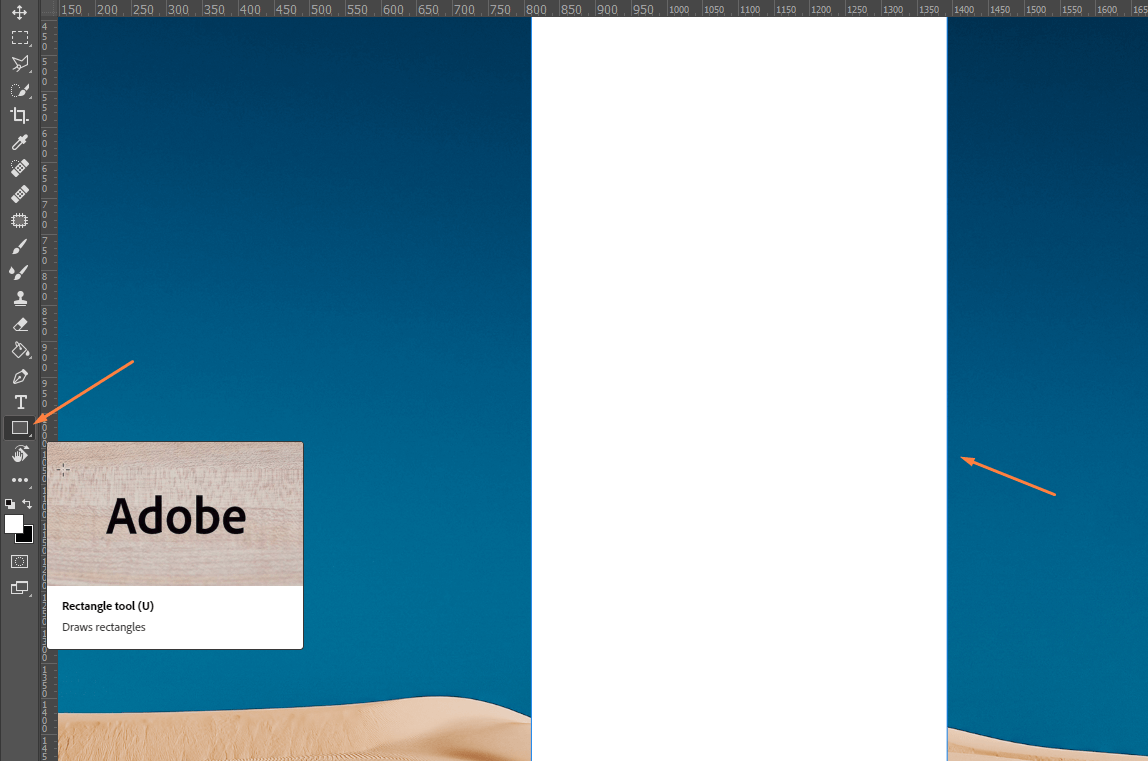
Step 3. We need to draw a rectangle. Create a new layer, choose the “Rectangle Tool” from the toolbox in the Tool Options Bar. To access the instrument quicker, press U. In the Options bar, you can customize the tool settings, including Fill, Stroke, Width, and Height. Once you’re done, start drawing.
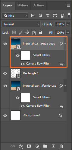
Step 4. Create a clipping mask. It uses the content and transparency of the layer below to control the visibility of the layer above. We need 2 layers to create a clipping mask – one will function as a mask and the other one will be clipped to the mask. Now, you need to duplicate the second layer.
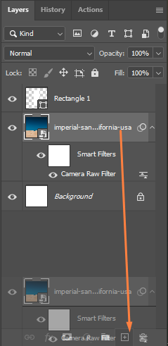
Click and drag the duplicated layer on top of the rectangle.
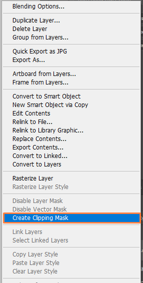
Open the Menu Bar and choose the Layer menu there. Next, click Create Clipping Mask.
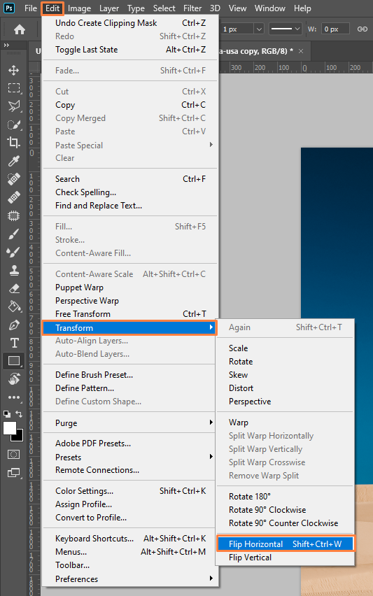
Step 5. Reflect the photo inside by choosing Edit > Transform > Flip Horizontal. You can do this operation quicker by pressing Shift+Ctrl+W/Shift+Cmd+W. However, depending on the creative photo manipulation ideas you have in mind, this step may be needless.
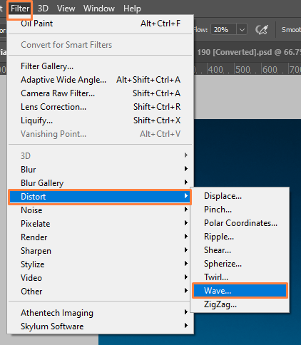
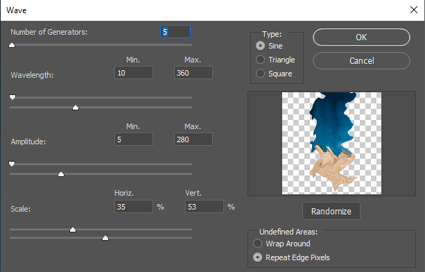
Step 6. Apply distortion. Choose Distort > Wave from the Filter menu. Popular photo manipulation artists frequently use this filter.
Here, you will see numerous parameters that affect the look of your album cover Photoshop, so adjust them sensibly. I recommend dragging sliders gradually and constantly monitoring how your photo is changed. There are 3 types of waves to experiment with – Sine, Triangle, and Square. In this case, we need Sine, which resembles a wave. We will also use 5 Wave Generators.
To change the distance between your “waves”, you need to resort to the Wavelengths. There are min and max points for this. Amplitude defines the strength of a wave. I chose 5 as Minimum and 280 as Maximum.
There is also the Scale. It is needed to alter the Height and Width of waves. There are no strict rules concerning these values and you should choose those best fitting your cover. Play with sliders and keep tabs on how your image transforms. If you use different dimensions and fonts, you should opt for different values. Once you like what you see, click OK.
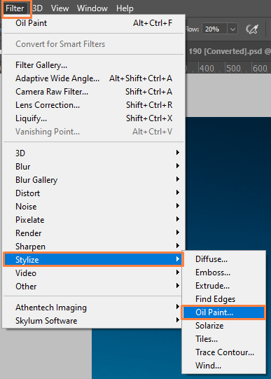
Step 7. Add stylization. Return to the Menu Bar and choose the Filter menu there. Click Stylize > Oil Paint.
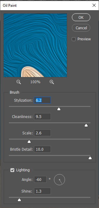
In the upper part of the screen, you can find the preview window. Below it, there are different options for controlling an oil painting effect. I recommend using the values from the screenshot. The first option is called Stylization. With its help, you can experiment with brush strokes, choosing the lowest setting that produces a daubed look, the highest values resulting in very smooth strokes, or anything in between.
The second brush option is Cleanliness. It affects the length of the brush strokes, with short strokes being manifested by more textures and details, and the long ones – fewer details and a cleaner look.
Next, you can see Scale, which controls the sizeand thickness of a brush. If you need a thin brush, choose the low Scale values, and do the opposite for a thicker brush.
The fourth place is occupied by Bristle Detail. It is responsible for altering the strength of the grooves created in the paint by the hairs of a brush. Using lower values, you will receive light and soft grooves. When you increase these values, the groves become stronger and more defined.
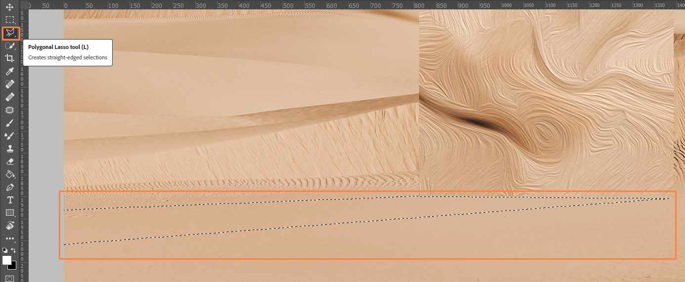
Step 8. It is important to add realistic shadows, which means your cover will acquire depth. For this, use the Polygonal Lasso Tool. By default, it is located behind the standard Lasso Tool in the Tools panel. Outline the area where you want to add shadow.
Add the Curves Adjustment Layer by going to Layer > New Adjustment Layer > Curves. If the Adjustments palette is activated, click on the Curves icon in the top left row of icons.
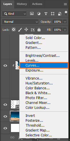
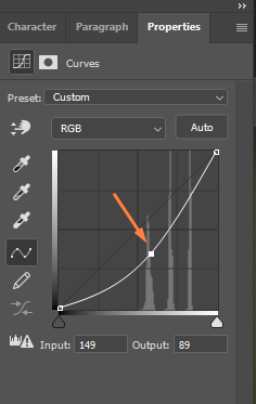
Next, drag the curve downwards to create a shadow. Control the intensity of a shadow by tracking your photo.
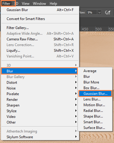
The best retouchers recommend using the Gaussian Blur tool to blur the edges a bit. Go to Filter > Blur > Gaussian Blur. You will see the needed window.
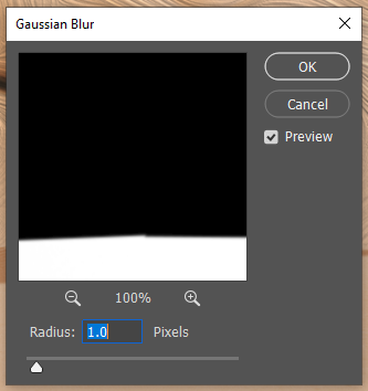
Drag your photo to the window that has opened to define the object you want to blur. By ticking the Preview box, you can see your photo with the Gaussian blur applied and evaluate its aesthetic appeal. Move the Radius slider till you like the amount of the blur.
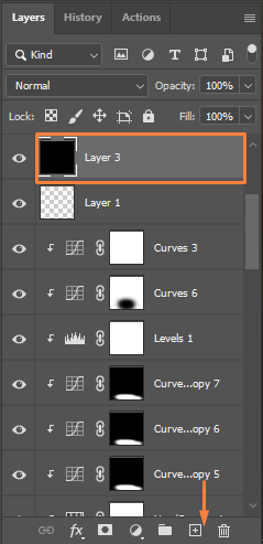
Step 9. Embellish your photo with a lens flare. Click the New Layer button in the Layers panel to create an empty later. Fill it in black.
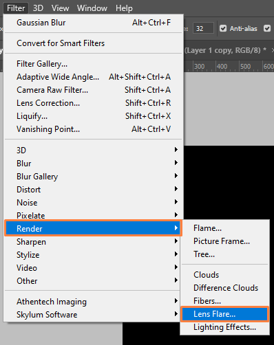
There is a special Lens Flare filter in the Filter menu that you should use to add the lens flare to your album cover Photoshop. Once there, choose Render> Lens Flare.
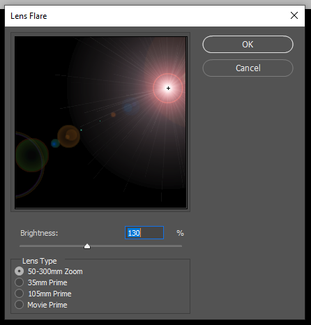
There will appear the Lens Flare dialog box with the Lens Type section where you will see 4 different types of lenses (50-300 mm Zoom, 35mm Prime, 105mm Prime, and Movie Prime) to choose from.
Each lens produced a different look, so make sure to try them all to perfectly understand which lens will work in your case. Evaluating the result is easy in the preview area. I will choose the default 50-300mm Zoom lens. There is also the Brightness slider, moving which, you can change this parameter. I will stick to the default 100%.
Relocating the lens flare is a breeze. You just need to click inside the preview area and the spot will become the center of the flare. It is shown as a little target symbol. You can also move the flare around but make sure to place it over the light source for a lifelike outcome. In my situation, I should place it over the sun.
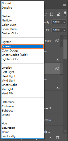
While on this layer, click on the Blending modes menu at the top of the Layers palette and set the new layer’s blend mode to Screen. Thus, all black areas will disappear and only the flare will be left.
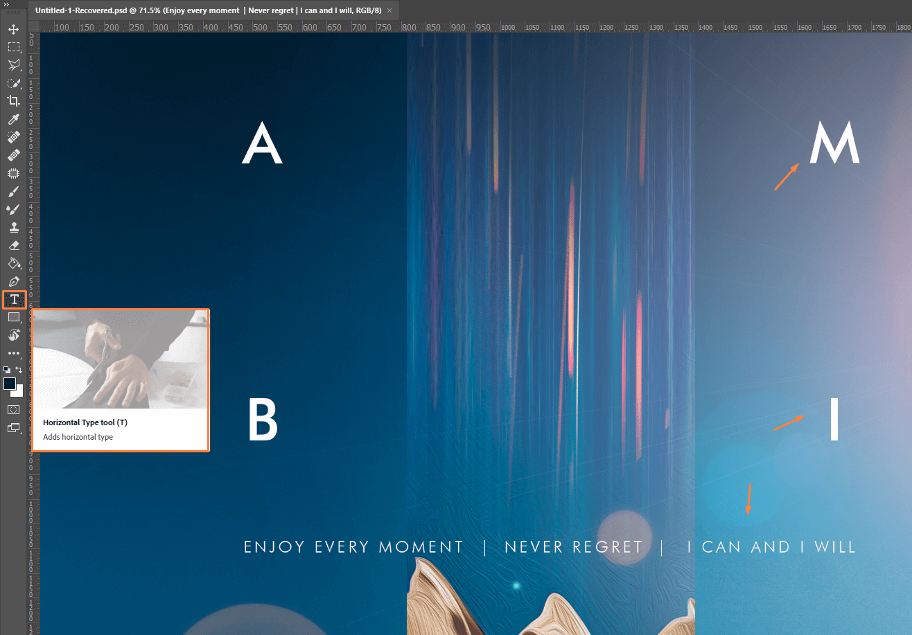
Step 10. Move to the tools palette, choose the Type tool there to complement your photo with text. There will appear the text settings menu in the upper part of the screen. With the Type tool selected, click anywhere on your photo to create a text box and start typing.
Keep in mind that the text can only include a title and artist name. The text in the artwork and that in the metadata (on the release info) should match up.
FAQ
- What is the perfect album cover size in Photoshop?
The range of 1600 x 1600 pixels – 3000 x 3000 pixels works best for streaming services. For physical CD covers, use 4.72in x 4.72 inches (perfect square). The lowest acceptable DPI equals 72 but most services require 300 DPI. Using this value or a higher one, you can create a cover suitable for print. Besides, handling such covers is easier. A good rule of thumb is to save an album cover in several lower sizes. Remember that you can never resize up.
- Is it legal to use a painting as an album cover?
If a painting is copyrighted, it is forbidden to use any of its copies (reproduction) without special permission. Even if you own the original painting, you need to ask an author to sign a document indicating that you are allowed to use it publicly. If there spring up copyright issues, streaming services will remove cover art or even a song with all plays generated.
- How to create a good album cover?
There are 3 core aspects to keep in mind while designing a cover. These are colors, imagery, and typography. If they are in harmony, your cover is bound to please an eye.
- What app do TikTokers use to make album covers?
They typically choose an iPhone photo editor such as PicsArt for the task. You need to import an album cover video from your camera roll, take a screenshot, and save it as a “parental advisory” sticker.
- Should I use PNG or JPG for an album cover?
PNG is a lossless format, so you’d better use it for saving your album covers. However, some distributors require JPG images. If you want to save a photo with text, opt for PNG.
- Weedit.Photos Blog
- Editing Tips & Tutorials
- How to Make an Album Cover in Photoshop in 10 Steps
