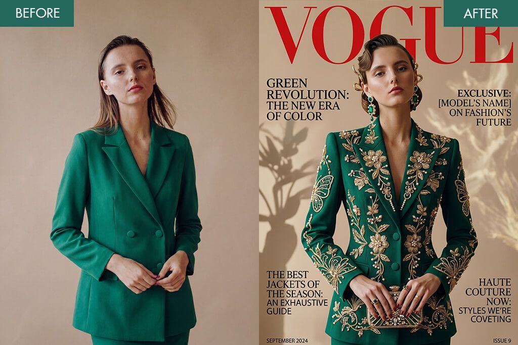
7 Best Vogue Filter Apps for Fancy Look

Reader questions have been piling up in my inbox lately. Most of them circle around, turning personal photos into Vogue-worthy magazine covers. As a designer, I handle this kind of work daily using professional tools, fine-tuning everything from layout and typography to retouching. Getting an editorial look takes skill and software. But what if you want stunning results straight from your phone?
So, I decided to test several Vogue filter apps. I wanted to cut through the marketing promises and find out what these tools are capable of. During testing, I focused on composition quality, text styling, and realism. The lineup I chose covers a solid range of approaches. Some apps lean on ready-made templates and AI-driven enhancements for a quick experience. Others hand you the creative reins, letting you dial in typography, tweak color grading, and fine-tune every detail. Whatever your skill level, there’s likely something here worth exploring.
Vogue Cover Basics

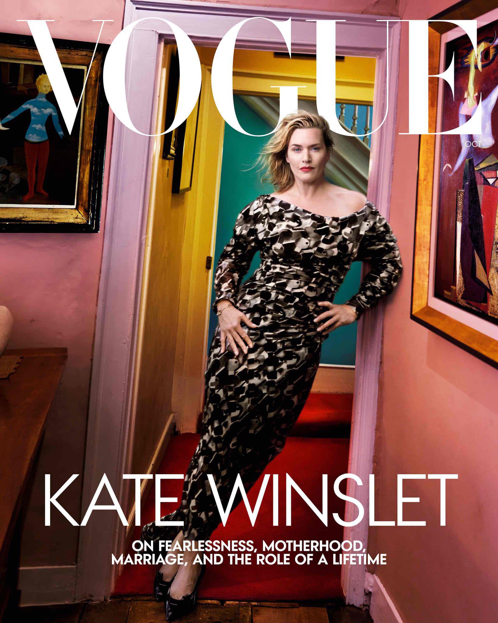
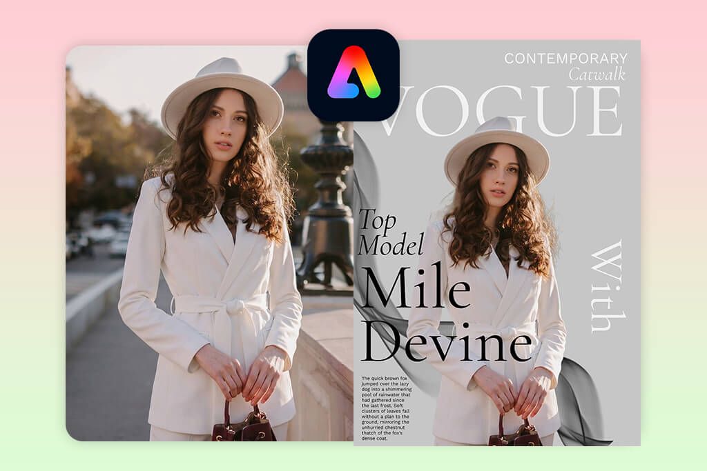
A genuine Vogue-style cover is more than a photo with text dropped on top. It’s a carefully constructed visual story like a cover with Zendaya. Real editorial covers follow a deliberate structure. There is a commanding subject, a strong focal point anchored by the face, and balanced typography.
One signature trick is that the masthead partially disappears behind the subject, creating depth and that unmistakable magazine feel. Skip this detail, and even a well-designed layout risks looking like a generic template.
Before touching any text or filters, I always start with composition. Take a look at the covers shot by Annie Leibovitz, and you’ll notice the subject is never placed randomly. There’s always intentional breathing room left for headlines to live comfortably without fighting the image.
A tightly cropped or overly busy photo leaves you nowhere to work with. The sweet spot is a subject positioned at the center or slightly off to one side, with clean, open background zones around it. This negative space makes text placement feel natural and purposeful. Get the composition right first, and everything else becomes noticeably easier.
Lighting is something many people overlook, yet it quietly makes or breaks the entire design. Editorial covers require controlled and intentional light, not artificially boosted or harshly filtered. When the light source in your photo is muddy or inconsistent, any text you add will feel like it’s floating rather than belonging.
A practical rule is to avoid placing bold white text over bright highlight areas, as it kills readability and throws off the visual balance. Photos with soft, directional light tend to work best, preserving depth while keeping the image clean enough to hold typography comfortably.
Typography is where most Vogue filter apps stumble. Strong covers like the iconic Kate Moss British Vogue shoot use a clear hierarchy: one dominant masthead, a couple of supporting lines, and consistent alignment throughout. The most common mistake is cramming in too many text elements or clashing font styles that pull attention in different directions. Keep yourself to two or three text styles at most. Then focus on the details, namely, letter spacing and line height in particular.
Still, the most common mistake isn’t a technical one. It’s a creative one. Recreating a Vogue-style cover without a clear concept behind it almost always falls flat. Every compelling cover tells a story. The image, styling, and text pull in the same direction. When those elements don’t agree, the result looks accidental. Before touching any app, decide whether you want minimalistic, bold, high-fashion, or relaxed editorial direction, and let that choice guide every decision.
1. Adobe Express
- Top-quality templates
- Extensive customization
- Proper text controls
- Easy duplication workflow
- Consistent design output
- Templates lack originality
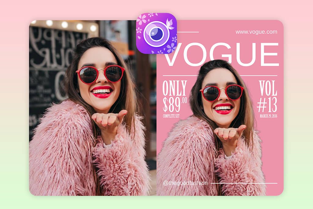
Adobe Express had already earned my trust. So, when readers began asking how to create Vogue-style covers in a quick way, it was the first tool I thought of. I knew it offered relevant templates. I just wanted to find out whether you could push them far enough to escape that unmistakable “template” look.
I started in the Templates tab, typed “Vogue cover” into the search bar, and selected a layout with a clean masthead and generous negative space. If you’re searching for the best Vogue filter app to recreate editorial aesthetics, Adobe Express is genuinely worth your attention, especially once you move beyond the default settings.
After dropping in my photo, the first thing I adjusted was the crop. Positioning the subject so they slightly overlapped the title text instantly gave the cover more depth and a professional magazine feel. From there, I jumped into the Text panel and replaced the headline, name, and supporting captions, while experimenting with fonts and letter spacing along the way. Some templates here do lean toward safe, generic arrangements, so I made a few alignment and scale tweaks to prevent a stock look.
With the layout locked in, I used the Styles tab to test color palettes and pull the overall design together visually. I also duplicated the project through the three-dot menu to compare two versions simultaneously. The result was cohesive and intentional. The text sat naturally within the composition rather than floating awkwardly on top, which differentiates a good cover from a great one.
2. YouCam Perfect
- Easy to master
- Quick editing workflow
- Top-notch face editing tools
- Lots of templates
- Fast text customization
- Restricted layout control
YouCam Perfect keeps showing up in recommendations across social media, and after spending time with it myself, the popularity makes complete sense. Unlike traditional design tools, this app is built around fast visual transformations. That philosophy shapes the entire experience from the moment you open it. Getting started is easy. I navigated to Templates, then Magazine, where a dedicated category of cover-style layouts was already waiting.
I selected a preset, and the workflow clicked into place naturally. I just needed to tap to swap in your photo, type directly into the headline field (I manually entered “VOGUE”), then refine the smaller supporting text below. As a Vogue filter app, YouCam Perfect has much to offer. The font library alone offers enough clean, editorial options to make your result look intentional rather than rushed. Some styles lean playful, but with a little browsing, the right fit is easy to find.
Before locking in the final layout, I made a quick detour into the Beautify section to fine-tune skin tone and lighting. The honest trade-off here is control. You won’t get pixel-level precision over layout decisions.
However, for the audience this app is designed for, that’s rarely the point. The goal is a sharp, social-ready image produced quickly, and on that front, YouCam Perfect delivers without question. The finished cover looked eye-catching and well-composed for something that came together in just a few minutes.
3. Fix The Photo Body Editor & Tune

- Real human retouchers
- Natural-looking results
- Custom edit requests
- No AI artifacts
- High detail accuracy
- No instant one-tap edit
Fix The Photo Body Editor & Tune is powered by actual retouching professionals, which makes it a completely different experience from anything filter-based. In fact, it’s the most feted app that photographers because it delivers natural-looking edits without demanding hours of manual work.
The workflow is understandable. After opening the app and uploading your photo, you skip the usual filters and sliders entirely. Instead, you type exactly what you want in a text field. My instructions were straightforward: adjust the lighting, smooth skin naturally, and give the image a magazine-worthy finish. I also selected options like “Skin Smoothing” and “Face Refinement,” then submitted. That’s genuinely all it takes.
Nothing about the result looked AI-generated or over-processed. Skin retouching came across as subtle and believable, lighting was naturally balanced, and fine details like facial texture, symmetry, and overall depth were handled with care that not all AI photo enhancer apps can properly take care of.
One thing worth noting: this isn’t a free Vogue filter app for photos. However, at $0.99 for three photos, with your very first edit included at no cost, the pricing is easy to justify once you see what you’re actually getting. For anyone who wants professional-quality edits without the professional-level effort, this one is worth checking out.
4. Canva
- Amazing collaboration tools
- Drag-and-drop editor
- Many templates
- AI-powered features
- Simple multi-format export
- Easy to go overboard with editing
- Some features are paid
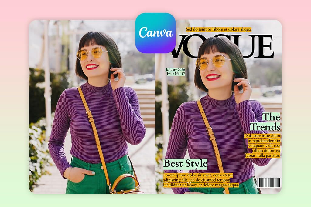
When I started exploring Vogue-style cover tools, Canva was the natural choice, and not only because of its design features. Thanks to the platform’s built-in collaboration tools, it was easy to work with others. Besides, since I was already familiar with the interface, I could focus on the creative side straight away.
I navigated to “Templates,” searched for “Vogue cover,” and landed on a layout that had a strong masthead and clean, editorial spacing. The drag-and-drop editor handled everything from there. I uploaded my photo, resized it, and carefully adjusted its placement so it sat naturally within the existing text layers.
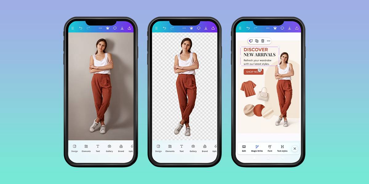
Tweaking the typography came next. Canva’s font library covers a nice range of serif and sans-serif styles, so I tried several combinations before landing on a pairing that was authentically magazine-worthy. I also ran the subject through the “Edit Image” > background removal tool, which instantly made the composition look more intentional and professionally structured. For good measure, I tested Magic Media to create an alternative background.
What sets Canva apart from a typical free Vogue filter app is the level of control it gives you. It is possible to reposition elements, fine-tune spacing, and even use Magic Resize to reformat your cover design into a social post in seconds. The sheer volume of features (AI tools, visual effects, and premium assets) can tempt you into overdoing it. The collaboration function was the final thing I tested. I shared the design through a link and reviewed it from another device. The layout held up beautifully.
5. CapCut

- Advanced AI design tools
- Prompt-based editing
- Natural lighting results
- Proper layer management
- High-quality export
- Prompt-sensitive results
- Interface may be confusing at first
CapCut tends to get pigeonholed as an AI video generator with editing features, but spend some real time inside it, and you’ll quickly realize it’s evolved into something far more versatile. During my testing, I discovered it can handle full visual concepts, including Vogue-style magazine covers. It occupies a sweet spot between a basic AI Vogue filter app and a professional design suite.
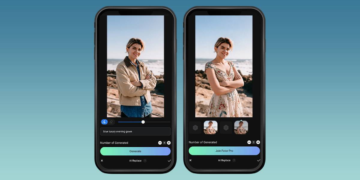
I started in the “AI Design” tab. The process resembled bouncing ideas off a creative collaborator. After uploading my photo, I entered a prompt: “high-fashion portrait, cinematic lighting, glossy skin, magazine style.” The generated result was impressively stylized, though I quickly learned that prompt quality matters enormously here. Vague descriptions produce generic output, so refining your wording upfront is important.
From there, I applied “AI Color Correction,” which balanced the tones and gave the lighting a convincing studio quality almost immediately. Building the cover layout came next. Through “Edit Elements,” I added the “VOGUE” title and layered it so the text sat slightly behind the subject’s head. Right from the “Adjust” panel, I could fine-tune brightness and contrast by hand.
I also used the AI Background Remover. It handled complex edges, including hair, with noticeably clean results.
6. Snapchat
- Official Vogue filters
- Top results without editing
- Different lens styles
- Real-time preview
- No customization control
- Non-tweakable layouts
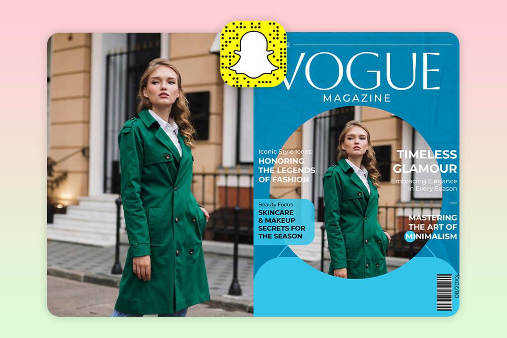
Snapchat isn’t the first platform that comes to mind for magazine-style design, but its lens library holds a genuine surprise. There’s an official Vogue collaboration built right in, and it delivers cover-ready results faster than almost any Vogue filter app online I’ve come across.
Finding it takes seconds. I tapped the search icon in the camera view, typed “Vogue,” and immediately had several options to choose from: “Vogue x Snapchat,” “Vogue Cover,” and “Vogue BnW” among them. I selected the official collaboration lens, and the effect kicked in instantly, framing my face, placing the masthead, and adjusting tones all in real time. There’s no uploading, editing, or exporting involved.
You simply point the camera, find your angle, and shoot the final result directly. Switching between lenses was worth doing, too. Some leaned into animated elements, while others focused on high-contrast black-and-white editorial aesthetics. Each has its own distinct personality.
Still, there is a trade-off. Since everything runs through a pre-built lens, creative control is essentially off the table. The masthead stays where it is, the typography is fixed, and layout adjustments aren’t possible. What you see is what you get. For anyone wanting to experiment quickly or create casual content, Snapchat’s Vogue lenses work remarkably well. Just don’t expect to customize the finer details.
7. Kapwing
- Video + image handling
- Adjustable layout
- AI background generation
- Cloud-based workflow
- Lacks ready-made templates
- Requires manual involvement
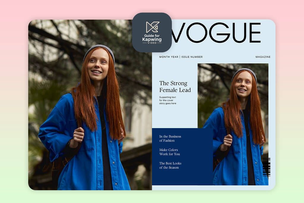
A friend tipped me off about Kapwing, which is not the obvious choice when you think about cover design. I always considered it a video editing app for Android, but once I dug in, it made total sense why she brought it up. This tool amazes users where still images and motion collide, making it ideal when your Vogue-style shot is part of something larger, e.g., a reel or a branded series.
Setting up was straightforward. I started a new project and landed on the timeline view, which is intuitive even for first-timers. I dropped my image onto the canvas, then headed straight to the AI Image Generator to craft a custom backdrop rather than settling for a stock option. Layering it behind the subject resulted in an editorial feel, similar to what you’d expect from a Vogue filter app for Instagram.
Building the masthead took a bit of manual effort since there’s no dedicated Vogue template section. I used the Text tool to construct it from scratch, and enjoyed the creative control it gave me. One standout feature worth mentioning is the collaborative editing mode. Open a shared project link and edits appear in real time – very much like Google Docs.
I also played around with Magic Create, which generates visual concepts from prompts, though it skews toward video rather than static layouts. If you prefer drag-and-drop templates, Kapwing may feel slightly hands-on. But if you enjoy building intentionally, it is a solid tool.
FAQ
- Do apps truly follow real Vogue design principles?
Not quite. Most of them offer a surface-level look, but can’t properly replicate visual hierarchy, intentional spacing, and layered depth. After meticulously testing several tools, I found that very few give you enough control to fine-tune those elements. So, while a result may turn heads at thumbnail size, it rarely holds up under scrutiny.
- Why do some magazine covers still look off, even with a great photo?
It happens because of a disconnect between the photo and the text – mismatched lighting, shadows that don’t align, or a screwed-up typography perspective. I’ve seen this repeatedly, especially when testing Vogue filter apps on Android and iOS. Font choices and letter spacing are often the culprits. These are subtle things, but they’re exactly what separates a catchy cover from one that looks assembled rather than crafted.
- Are AI-generated Vogue covers better than template-based ones?
AI excels at mood, lighting, and editorial style, especially without a perfect source photo. Templates bring structure and reliability. In my experience, combining both, which is a growing part of the Vogue filter app TikTok trend, consistently shows the strongest results.
- Is it okay to use these covers for commercial projects?
That depends on the app’s terms and your intended use. Licensing varies widely, and the Vogue trademark is worth considering when it comes to commercial publishing. Personal or social media use is typically fine, but anything business-related deserves a closer look at the fine print first.
- Should I hire a professional to make a Vogue-style cover?
It depends on your project. Apps are excellent for quick experimentation, but they have a ceiling. A professional brings genuine creative judgment, catching subtle mismatches in lighting, refining typography placement, and making every element intentional rather than assembled. If you’re after something that holds up to real editorial standards, that expertise is hard to replace.